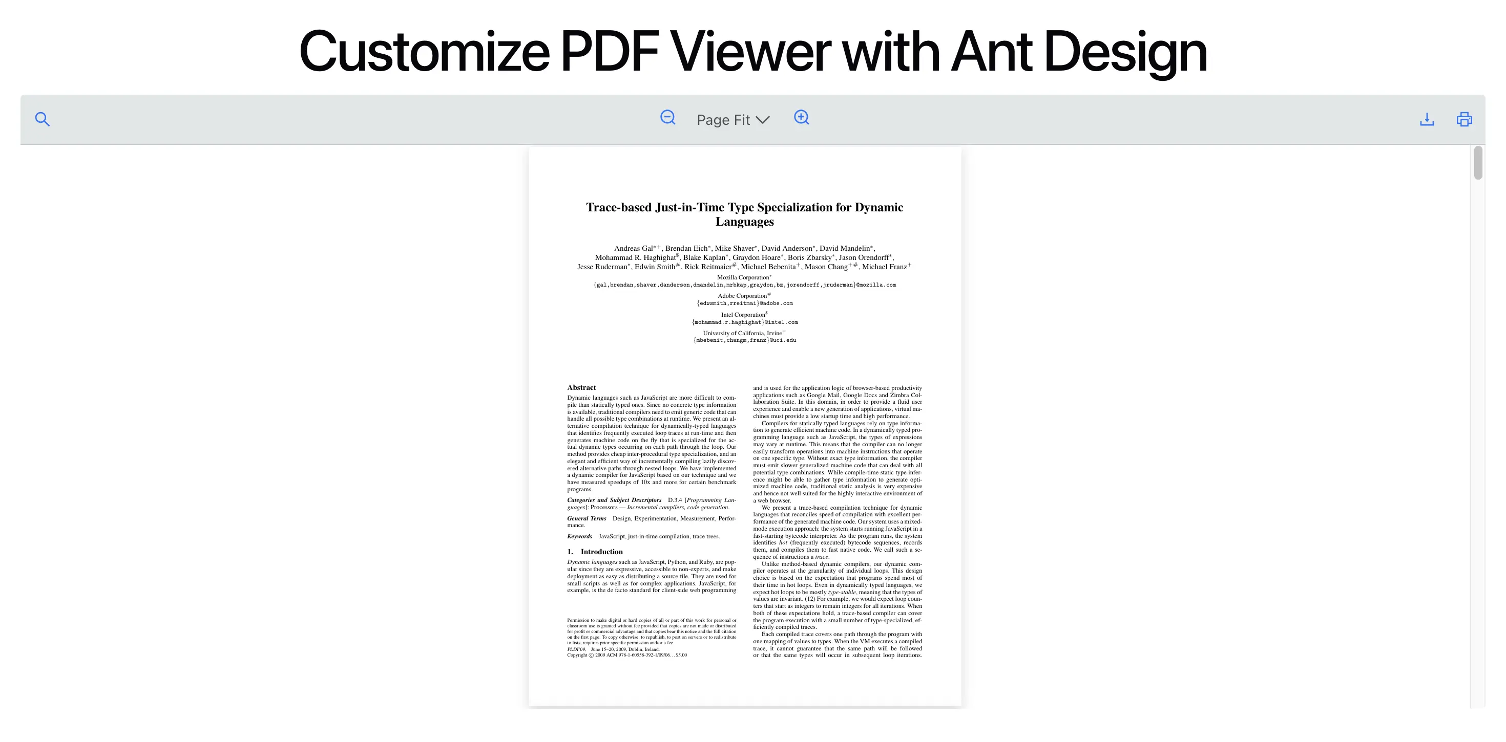
Build Your Own Toolbar with Ant Design
This guide walks through building a custom PDF viewer toolbar with Ant Design (antd). You use React PDF Kit for PDF rendering and Ant Design for toolbar UI such as icons, theming, and custom layout.
The library supports two ways to build with Ant Design:
- Build with Ant Design using the default toolbar - Use the built-in
RPLayoutandRPHorizontalBarwith a slots map to show or hide default tools, and the icons prop to swap in@ant-design/icons. Optionally wrap in RPTheme with customVariables to style the toolbar (often driven bytheme.useToken()). - Build with Ant Design using the Context API - Build the entire toolbar from scratch with Ant Design only (
Card,Flex,Button,Input, etc.) and wire every action through the library’s React Context hooks (zoom, pagination, search, print, download). Full control over layout and styling.
Build with Ant Design using the default toolbar
Section titled “Build with Ant Design using the default toolbar”The default toolbar layout is provided by the library. You can choose which tools to show or hide, and override icons with @ant-design/icons dependency.
Use RPLayout and RPHorizontalBar with a slots map to show or hide built-in tools, and pass the icons prop to replace the default icons.
-
Define an enum (or object) for the toolbar slot keys the viewer expects. This keeps slot names in one place and matches the keys used by
RPHorizontalBar.src/lib/types.js export const PDF_VIEWER_TOOL = Object.freeze({searchTool: "searchTool",pageNavigationTool: "pageNavigationTool",zoomTool: "zoomTool",themeSwitcher: "themeSwitcher",downloadTool: "downloadTool",openFileTool: "openFileTool",printTool: "printTool",fullscreenTool: "fullscreenTool",jumpNavigationTool: "jumpNavigationTool",selectionModeTool: "selectionModeTool",rotateTool: "rotateTool",viewModeTool: "viewModeTool",scrollModeTool: "scrollModeTool",documentProperties: "documentProperties",thumbnailTool: "thumbnailTool",sidebarEnable: "sidebarEnable",dropFileZone: "dropFileZone",});src/lib/types.ts export enum PDF_VIEWER_TOOL {searchTool = "searchTool",pageNavigationTool = "pageNavigationTool",zoomTool = "zoomTool",themeSwitcher = "themeSwitcher",downloadTool = "downloadTool",openFileTool = "openFileTool",printTool = "printTool",fullscreenTool = "fullscreenTool",jumpNavigationTool = "jumpNavigationTool",selectionModeTool = "selectionModeTool",rotateTool = "rotateTool",viewModeTool = "viewModeTool",scrollModeTool = "scrollModeTool",documentProperties = "documentProperties",thumbnailTool = "thumbnailTool",sidebarEnable = "sidebarEnable",dropFileZone = "dropFileZone",} -
Build a slots object that enables only the tools you want. For each slot key, set
trueto use the default tool orfalseto hide it. No custom components are required; the library’s default tools are used and you only control visibility.src/components/AppCustomizePdfViewer.jsx import { useMemo } from "react";import { PDF_VIEWER_TOOL } from "../lib/types";const slots = Object.values(PDF_VIEWER_TOOL);const AVAILABLE_TOOLS = [PDF_VIEWER_TOOL.searchTool,PDF_VIEWER_TOOL.zoomTool,PDF_VIEWER_TOOL.downloadTool,PDF_VIEWER_TOOL.printTool,];const renderSlots = Object.fromEntries(slots.map((key) => {return [key, AVAILABLE_TOOLS.includes(key)];}),);src/components/AppCustomizePdfViewer.tsx import { useMemo, type FC } from "react";import { PDF_VIEWER_TOOL } from "../lib/types";const slots = Object.values(PDF_VIEWER_TOOL);const AVAILABLE_TOOLS = [PDF_VIEWER_TOOL.searchTool,PDF_VIEWER_TOOL.zoomTool,PDF_VIEWER_TOOL.downloadTool,PDF_VIEWER_TOOL.printTool,];const renderSlots = Object.fromEntries(slots.map((key) => {return [key, AVAILABLE_TOOLS.includes(key)];}),);- AVAILABLE_TOOLS: Array of slot keys to show in the toolbar; all other slots are disabled.
- renderSlots: Map of every slot key to
true(show default tool) orfalse(hide).
-
(Optional) Wrap the viewer in
RPThemeand pass customVariables to style the default toolbar (tooltip background, button padding, border radius, text color).With Ant Design, you can keep these as fixed CSS values or derive them from
theme.useToken()so the toolbar tracksConfigProvidertokens (see step 4).<RPThemecustomVariables={{"--rp-tooltip-background-color": "#0000008a","--rp-button-padding": "6px 8px","--rp-button-border-radius": "6px","--rp-text-color": "#0000008a",}}>{/* RPProvider and RPLayout go here */}</RPTheme><RPThemecustomVariables={{"--rp-tooltip-background-color": "#0000008a","--rp-button-padding": "6px 8px","--rp-button-border-radius": "6px","--rp-text-color": "#0000008a",}}>{/* RPProvider and RPLayout go here */}</RPTheme> -
Use
RPProviderwith your PDFsrc, then RPLayout withtoolbar.topbar.componentset toRPHorizontalBar. Passslots(from step 2) andiconsto replace default icons with components from@ant-design/icons. Usetheme.useToken()forRPThemevariables and for consistent icon color and size.src/components/AppCustomizePdfViewer.jsx import {DownloadOutlined,PrinterOutlined,SearchOutlined,ZoomInOutlined,ZoomOutOutlined,} from "@ant-design/icons";import { theme } from "antd";import { RPProvider, RPPages, RPLayout, RPHorizontalBar, RPTheme } from "@react-pdf-kit/viewer";import { useMemo } from "react";import { PDF_VIEWER_TOOL } from "../lib/types";const slots = Object.values(PDF_VIEWER_TOOL);const AVAILABLE_TOOLS = [PDF_VIEWER_TOOL.searchTool,PDF_VIEWER_TOOL.zoomTool,PDF_VIEWER_TOOL.downloadTool,PDF_VIEWER_TOOL.printTool,];const renderSlots = Object.fromEntries(slots.map((key) => {return [key, AVAILABLE_TOOLS.includes(key)];}),);const AppCustomizePdfViewer = () => {const { token } = theme.useToken();const rpThemeVars = useMemo(() => ({"--rp-tooltip-background-color": token.colorText,"--rp-button-padding": "6px 8px","--rp-button-border-radius": `${token.borderRadius}px`,"--rp-text-color": token.colorTextSecondary,}),[token],);const iconStyle = useMemo(() => ({fontSize: 16,color: token.colorPrimary,}),[token.colorPrimary],);return (<RPTheme customVariables={rpThemeVars}><RPProvider src="https://raw.githubusercontent.com/mozilla/pdf.js/ba2edeae/web/compressed.tracemonkey-pldi-09.pdf"><divstyle={{flex: 1,minHeight: 0,display: "flex",flexDirection: "column",}}><RPLayouttoolbar={{topbar: {component: (<RPHorizontalBarslots={renderSlots}icons={{searchIcon: <SearchOutlined style={iconStyle} />,zoomInIcon: <ZoomInOutlined style={iconStyle} />,zoomOutIcon: <ZoomOutOutlined style={iconStyle} />,downloadIcon: <DownloadOutlined style={iconStyle} />,printIcon: <PrinterOutlined style={iconStyle} />,}}/>),},}}><RPPages /></RPLayout></div></RPProvider></RPTheme>);};export default AppCustomizePdfViewer;src/components/AppCustomizePdfViewer.tsx import {DownloadOutlined,PrinterOutlined,SearchOutlined,ZoomInOutlined,ZoomOutOutlined,} from "@ant-design/icons";import { theme } from "antd";import {RPProvider,RPPages,RPLayout,RPHorizontalBar,RPTheme,} from "@react-pdf-kit/viewer";import { useMemo, type FC } from "react";import { PDF_VIEWER_TOOL } from "../lib/types";const slots = Object.values(PDF_VIEWER_TOOL);const AVAILABLE_TOOLS = [PDF_VIEWER_TOOL.searchTool,PDF_VIEWER_TOOL.zoomTool,PDF_VIEWER_TOOL.downloadTool,PDF_VIEWER_TOOL.printTool,];const renderSlots = Object.fromEntries(slots.map((key) => {return [key, AVAILABLE_TOOLS.includes(key)];}),);const AppCustomizePdfViewer: FC = () => {const { token } = theme.useToken();const rpThemeVars = useMemo(() => ({"--rp-tooltip-background-color": token.colorText,"--rp-button-padding": "6px 8px","--rp-button-border-radius": `${token.borderRadius}px`,"--rp-text-color": token.colorTextSecondary,}),[token],);const iconStyle = useMemo(() => ({fontSize: 16,color: token.colorPrimary,}),[token.colorPrimary],);return (<RPTheme customVariables={rpThemeVars}><RPProvider src="https://raw.githubusercontent.com/mozilla/pdf.js/ba2edeae/web/compressed.tracemonkey-pldi-09.pdf"><divstyle={{flex: 1,minHeight: 0,display: "flex",flexDirection: "column",}}><RPLayouttoolbar={{topbar: {component: (<RPHorizontalBarslots={renderSlots}icons={{searchIcon: <SearchOutlined style={iconStyle} />,zoomInIcon: <ZoomInOutlined style={iconStyle} />,zoomOutIcon: <ZoomOutOutlined style={iconStyle} />,downloadIcon: <DownloadOutlined style={iconStyle} />,printIcon: <PrinterOutlined style={iconStyle} />,}}/>),},}}><RPPages /></RPLayout></div></RPProvider></RPTheme>);};export default AppCustomizePdfViewer;
Notes
- Use RPHorizontalBar to render the default horizontal toolbar. Control which tools are visible with slots and override the icons with the
iconsprop. - Use RPLayout to wrap the toolbar and
RPPages.
Build with Ant Design using the Context API
Section titled “Build with Ant Design using the Context API”Build the entire toolbar yourself with Ant Design only. Use Card, Flex, Button, Input, Tooltip, Typography, and icons from @ant-design/icons, and keep the toolbar inside RPProvider so it can use the context hooks. You control layout and styling completely.
Key pieces:
- App: Wrap React PDF in
RPConfig(with license key) and render the viewer component (e.g.AppPdfViewer). - AppPdfViewer: Use
RPProviderwith a PDFsrc, a sized container, the Ant Design toolbarCustomHorizontalBar, andRPPages. - CustomHorizontalBar: Your Ant Design toolbar:
Card,Flex, and composed Zoom, Pagination, Download, Print, and Search tools. - Tool components: Each tool uses one hook from
@react-pdf-kit/viewerfor behavior and renders only Ant Design controls.
Hooks to Use
Section titled “Hooks to Use”The same hooks power the built-in tools when you use slots on RPHorizontalBar, and the custom Ant Design tool components when you use this Context API approach.
| Ant Design tool component | Hook | Purpose |
|---|---|---|
ZoomTool | useZoomContext | Zoom in/out via setZoomLevel |
PaginationTool | usePaginationContext | Page index, total, nextPage, prevPage |
DownloadTool | useFileDownload | Trigger file download |
PrintTool | usePrintContext | Trigger print |
SearchTool | useSearchContext | Query, set query, prev/next match, counts |
-
At the root of your app, wrap the React PDF Viewer component in
RPConfigand pass your domain token. RenderAppPdfViewerinside it so the PDF viewer and its configuration are available to the rest of the tree.src/App.jsx import "./App.css";import { RPConfig } from "@react-pdf-kit/viewer";import AppPdfViewer from "./components/AppPdfViewer";function App() {return (<RPConfig licenseKey={"YOUR_DOMAIN_TOKEN"}><AppPdfViewer /></RPConfig>);}export default App;src/App.tsx import "./App.css";import { RPConfig } from "@react-pdf-kit/viewer";import AppPdfViewer from "./components/AppPdfViewer";function App() {return (<RPConfig licenseKey={"YOUR_DOMAIN_TOKEN"}><AppPdfViewer /></RPConfig>);}export default App; -
Create the
AppPdfViewercomponent. UseRPProviderwith your PDF URL and a containerdiv(or any layout) that holds the toolbar andRPPages. The toolbar must stay insideRPProviderso the context hooks (zoom, pagination, search, and so on) are available.src/components/AppPdfViewer.jsx import { RPProvider, RPPages } from "@react-pdf-kit/viewer";import { CustomHorizontalBar } from "./CustomHorizontalBar";const AppPdfViewer = () => {return (<RPProvider src="https://raw.githubusercontent.com/mozilla/pdf.js/ba2edeae/web/compressed.tracemonkey-pldi-09.pdf"><divstyle={{width: "100%",height: "600px",}}><CustomHorizontalBar /><RPPages /></div></RPProvider>);};export default AppPdfViewer;src/components/AppPdfViewer.tsx import { RPProvider, RPPages } from "@react-pdf-kit/viewer";import { type FC } from "react";import { CustomHorizontalBar } from "./CustomHorizontalBar";const AppPdfViewer: FC = () => {return (<RPProvider src="https://raw.githubusercontent.com/mozilla/pdf.js/ba2edeae/web/compressed.tracemonkey-pldi-09.pdf"><divstyle={{width: "100%",height: "600px",}}><CustomHorizontalBar /><RPPages /></div></RPProvider>);};export default AppPdfViewer; -
Create the
CustomHorizontalBarcomponent using Ant Design’sCardandFlex. Put zoom, pagination, download, and print in one group, and place the search control in a second group aligned to the right so the layout stays clear. Usetheme.useToken()for borders and backgrounds so the bar matches your Ant Design theme.src/components/CustomHorizontalBar.jsx import { Card, Flex, theme } from "antd";import { ZoomTool } from "./ZoomTool";import { PaginationTool } from "./PaginationTool";import { DownloadTool } from "./DownloadTool";import { PrintTool } from "./PrintTool";import { SearchTool } from "./SearchTool";export const CustomHorizontalBar = () => {const { token } = theme.useToken();return (<Cardsize="small"style={{borderBottom: "none",borderRadius: "8px 8px 0 0",background: token.colorPrimaryBg,borderColor: token.colorPrimaryBorder,}}styles={{body: {padding: "6px 12px",borderBottom: "none",borderRadius: "8px 8px 0 0",},}}><Flex align="center" justify="space-between" gap="small"><Flexalign="center"gap={4}style={{border: `1px solid ${token.colorPrimaryBorder}`,borderRadius: token.borderRadius,padding: "4px 8px",background: token.colorBgContainer,}}><ZoomTool /><PaginationTool /><DownloadTool /><PrintTool /></Flex><Flex align="center" justify="flex-end" flex={1}><SearchTool /></Flex></Flex></Card>);};src/components/CustomHorizontalBar.tsx import { Card, Flex, theme } from "antd";import { ZoomTool } from "./ZoomTool";import { PaginationTool } from "./PaginationTool";import { DownloadTool } from "./DownloadTool";import { PrintTool } from "./PrintTool";import { SearchTool } from "./SearchTool";export const CustomHorizontalBar = () => {const { token } = theme.useToken();return (<Cardsize="small"style={{borderBottom: "none",borderRadius: "8px 8px 0 0",background: token.colorPrimaryBg,borderColor: token.colorPrimaryBorder,}}styles={{body: {padding: "6px 12px",borderBottom: "none",borderRadius: "8px 8px 0 0",},}}><Flex align="center" justify="space-between" gap="small"><Flexalign="center"gap={4}style={{border: `1px solid ${token.colorPrimaryBorder}`,borderRadius: token.borderRadius,padding: "4px 8px",background: token.colorBgContainer,}}><ZoomTool /><PaginationTool /><DownloadTool /><PrintTool /></Flex><Flex align="center" justify="flex-end" flex={1}><SearchTool /></Flex></Flex></Card>);}; -
Each toolbar action is a small component that uses one hook from
@react-pdf-kit/viewerfor behavior and Ant Design components for the UI. Create the following files.4.1 ZoomTool: Use the
useZoomContexthook to control zoom. Add zoom in and zoom out controls that change the level by 10 each step, clamped between 10 and 1000.src/components/ZoomTool.jsx import { ZoomInOutlined, ZoomOutOutlined } from "@ant-design/icons";import { Button, Tooltip } from "antd";import { useZoomContext } from "@react-pdf-kit/viewer";import { useCallback } from "react";export const ZoomTool = () => {const { setZoomLevel } = useZoomContext();const handleZoomIn = useCallback(() => {setZoomLevel((prev) => Math.min(prev + 10, 1000));}, [setZoomLevel]);const handleZoomOut = useCallback(() => {setZoomLevel((prev) => Math.max(prev - 10, 10));}, [setZoomLevel]);return (<><Tooltip title="Zoom out"><Buttontype="text"size="small"icon={<ZoomOutOutlined />}onClick={handleZoomOut}aria-label="Zoom out"/></Tooltip><Tooltip title="Zoom in"><Buttontype="text"size="small"icon={<ZoomInOutlined />}onClick={handleZoomIn}aria-label="Zoom in"/></Tooltip></>);};src/components/ZoomTool.tsx import { ZoomInOutlined, ZoomOutOutlined } from "@ant-design/icons";import { Button, Tooltip } from "antd";import { useZoomContext } from "@react-pdf-kit/viewer";import { useCallback } from "react";export const ZoomTool = () => {const { setZoomLevel } = useZoomContext();const handleZoomIn = useCallback(() => {setZoomLevel((prev) => Math.min(prev + 10, 1000));}, [setZoomLevel]);const handleZoomOut = useCallback(() => {setZoomLevel((prev) => Math.max(prev - 10, 10));}, [setZoomLevel]);return (<><Tooltip title="Zoom out"><Buttontype="text"size="small"icon={<ZoomOutOutlined />}onClick={handleZoomOut}aria-label="Zoom out"/></Tooltip><Tooltip title="Zoom in"><Buttontype="text"size="small"icon={<ZoomInOutlined />}onClick={handleZoomIn}aria-label="Zoom in"/></Tooltip></>);};4.2 PaginationTool: Use the
usePaginationContexthook to read the current page and total page count. Add previous and next actions and a read-only field showing the current page with the total beside it (for example3 / 12).src/components/PaginationTool.jsx import { ArrowDownOutlined, ArrowUpOutlined } from "@ant-design/icons";import { Button, Input, Space, Tooltip, Typography } from "antd";import { usePaginationContext } from "@react-pdf-kit/viewer";export const PaginationTool = () => {const { focusedPage, totalPages, nextPage, prevPage } = usePaginationContext();return (<Space size={0} align="center"><Tooltip title="Previous page"><Buttontype="text"size="small"icon={<ArrowUpOutlined />}onClick={prevPage}aria-label="Previous page"/></Tooltip><Tooltip title="Current page"><InputreadOnlyvalue={focusedPage}size="small"variant="outlined"style={{ width: 48 }}styles={{ input: { textAlign: "center" } }}/></Tooltip><Typography.Text type="secondary" style={{ paddingInline: 4, minWidth: 28 }}>/ {totalPages}</Typography.Text><Tooltip title="Next page"><Buttontype="text"size="small"icon={<ArrowDownOutlined />}onClick={nextPage}aria-label="Next page"/></Tooltip></Space>);};src/components/PaginationTool.tsx import { ArrowDownOutlined, ArrowUpOutlined } from "@ant-design/icons";import { Button, Input, Space, Tooltip, Typography } from "antd";import { usePaginationContext } from "@react-pdf-kit/viewer";export const PaginationTool = () => {const { focusedPage, totalPages, nextPage, prevPage } = usePaginationContext();return (<Space size={0} align="center"><Tooltip title="Previous page"><Buttontype="text"size="small"icon={<ArrowUpOutlined />}onClick={prevPage}aria-label="Previous page"/></Tooltip><Tooltip title="Current page"><InputreadOnlyvalue={focusedPage}size="small"variant="outlined"style={{ width: 48 }}styles={{ input: { textAlign: "center" } }}/></Tooltip><Typography.Text type="secondary" style={{ paddingInline: 4, minWidth: 28 }}>/ {totalPages}</Typography.Text><Tooltip title="Next page"><Buttontype="text"size="small"icon={<ArrowDownOutlined />}onClick={nextPage}aria-label="Next page"/></Tooltip></Space>);};4.3 DownloadTool: Use the
useFileDownloadhook and call itsdownloadfunction when the user activates the control. Add a download button so the user can save the PDF file.src/components/DownloadTool.jsx import { DownloadOutlined } from "@ant-design/icons";import { Button, Tooltip } from "antd";import { useFileDownload } from "@react-pdf-kit/viewer";export const DownloadTool = () => {const { download } = useFileDownload();return (<Tooltip title="Download file"><Buttontype="text"size="small"icon={<DownloadOutlined />}onClick={download}aria-label="Download file"/></Tooltip>);};src/components/DownloadTool.tsx import { DownloadOutlined } from "@ant-design/icons";import { Button, Tooltip } from "antd";import { useFileDownload } from "@react-pdf-kit/viewer";export const DownloadTool = () => {const { download } = useFileDownload();return (<Tooltip title="Download file"><Buttontype="text"size="small"icon={<DownloadOutlined />}onClick={download}aria-label="Download file"/></Tooltip>);};4.4 PrintTool: Use the
usePrintContexthook and call itsprintfunction on click. Add a print button so the user can open the browser print dialog.src/components/PrintTool.jsx import { PrinterOutlined } from "@ant-design/icons";import { Button, Tooltip } from "antd";import { usePrintContext } from "@react-pdf-kit/viewer";export const PrintTool = () => {const { print } = usePrintContext();return (<Tooltip title="Print"><Buttontype="text"size="small"icon={<PrinterOutlined />}onClick={print}aria-label="Print"/></Tooltip>);};src/components/PrintTool.tsx import { PrinterOutlined } from "@ant-design/icons";import { Button, Tooltip } from "antd";import { usePrintContext } from "@react-pdf-kit/viewer";export const PrintTool = () => {const { print } = usePrintContext();return (<Tooltip title="Print"><Buttontype="text"size="small"icon={<PrinterOutlined />}onClick={print}aria-label="Print"/></Tooltip>);};4.5 SearchTool: Use the
useSearchContexthook for the search query and match navigation. Add anInputfor the search term, previous and next match buttons, and a short counter showing the current match index and total (for example2 / 5).src/components/SearchTool.jsx import { CaretDownOutlined, CaretUpOutlined, SearchOutlined } from "@ant-design/icons";import { Button, Input, Space, Tooltip, Typography } from "antd";import { useSearchContext } from "@react-pdf-kit/viewer";export const SearchTool = () => {const { search, setSearch, prevMatch, nextMatch, totalMatches, currentMatchPosition } =useSearchContext();const handleSearch = (e) => {setSearch(e.target.value);};return (<Space size="small" align="center"><Inputvalue={search}onChange={handleSearch}size="small"placeholder="Search"variant="outlined"prefix={<SearchOutlined style={{ color: "var(--ant-color-text-tertiary)" }} />}style={{ width: 180 }}aria-label="Search"/><Tooltip title="Previous match"><Buttontype="text"size="small"icon={<CaretUpOutlined />}onClick={prevMatch}aria-label="Previous match"/></Tooltip><Tooltip title="Next match"><Buttontype="text"size="small"icon={<CaretDownOutlined />}onClick={nextMatch}aria-label="Next match"/></Tooltip><Typography.Text type="secondary" style={{ minWidth: 36 }}>{currentMatchPosition} / {totalMatches}</Typography.Text></Space>);};src/components/SearchTool.tsx import { CaretDownOutlined, CaretUpOutlined, SearchOutlined } from "@ant-design/icons";import { Button, Input, Space, Tooltip, Typography } from "antd";import { useSearchContext } from "@react-pdf-kit/viewer";import type { ChangeEvent } from "react";export const SearchTool = () => {const { search, setSearch, prevMatch, nextMatch, totalMatches, currentMatchPosition } =useSearchContext();const handleSearch = (e: ChangeEvent<HTMLInputElement>) => {setSearch(e.target.value);};return (<Space size="small" align="center"><Inputvalue={search}onChange={handleSearch}size="small"placeholder="Search"variant="outlined"prefix={<SearchOutlined style={{ color: "var(--ant-color-text-tertiary)" }} />}style={{ width: 180 }}aria-label="Search"/><Tooltip title="Previous match"><Buttontype="text"size="small"icon={<CaretUpOutlined />}onClick={prevMatch}aria-label="Previous match"/></Tooltip><Tooltip title="Next match"><Buttontype="text"size="small"icon={<CaretDownOutlined />}onClick={nextMatch}aria-label="Next match"/></Tooltip><Typography.Text type="secondary" style={{ minWidth: 36 }}>{currentMatchPosition} / {totalMatches}</Typography.Text></Space>);}; -
(Optional) You may add a small module (for example
src/lib/const.ts) for shared layout or style constants that you reuse across the toolbar or other React PDF viewer components.src/lib/const.js export const CENTER_ALIGN_STYLE = { display: "flex", alignItems: "center" };src/lib/const.ts export const CENTER_ALIGN_STYLE = { display: "flex", alignItems: "center" };
Notes
- Use
RPConfigat the app root andRPProviderwith a PDFsrc. - Keep
CustomHorizontalBar(and all hook-based toolbar pieces) inside the sameRPProviderthat rendersRPPagesfor that document. - Implement each action as a small component that uses exactly one viewer hook (
useZoomContext,usePaginationContext,useFileDownload,usePrintContext,useSearchContext). useSearchContextdepends on the loaded PDF, until the document is ready match counts may be zero.